Simplifying the process of sending documents to Educational Institutes
How we used UX Design to identify problems in the administrative procedures of Brazilian Educational Institutes.

The Challenge
During the second week of September, 2020, the team composed by Barbara dos Santos, Guilherme Chan and Jailce Fernanda Brito accepted the challenge of unifying digital documentation solicitated by Educational Institutes, proposed by Leandro Rezende from the “UX Unicórnio” course.
The present situation
Why digitizing documents?
In the individual perspective, digitizing documents helps people to maintain a better organization of it, then, when an individual finds themselves in a situation where a specific document is mandatory, he/she wouldn’t need to spend time and effort to search for it, which was an issue most people had, according to our research. In the collective scope, specifically, business, digitalizing documents is not even a matter of organization, but could also be a key point for obtaining more profit. This is due to diverse factors, being the main one the streamlining of procedures, which in the context of the pandemic, could determine if a business would last.
The Educational Institutes and the digitization of documents:
How it should be
The flow of documents in a Educational Institute generally starts with an enrollment process, and this procedure, which occurs in a high quantity specially at the beginning of a new semester, consequently require documents from students throughout their school period for other procedures such as a school record request, for example. In 2018, the Ministry of Education published a government regulation (portaria 315), which stated that “Brazilian educational institutes should digitize all documents referring to related activities until April 2020”, with the main goal of facilitating the access for students of their documents such as school records or diplomas. This regulation stablished that students from higher education should have access to all their documents in a digital form, with the objective to optimize and to streamline this institutes procedure.
How it really is
With the pandemic there was a high increase of the non-payment rate in higher education institutes and, consequently, the requirement to facilitate the enrollment process for new students increased as well. This simplification of the procedure would be achieved easily if the requirements from the government regulation (portaria 135) were followed, but, during our research we realized the rules made by the Ministry of Education were not being followed, as an example, by the UNIP university.
How could we help people to deliver their documents to Educational Institutes without going out their homes?
Project Objective
Unify the documentation requested by Educational Institutes (EI) in a digital form.
User
- Decrease the quantity of documents a user needs to carry with to perform bureaucratic activities in the EI.
- Avoid the displacement to the EI to deliver the documents.
Educational Institute (EI)
- Avoid evasion
- Increase the number of enrollments
- Increase the income
- Facilitate the organization of documents of the EIs.
CSD Matrix
We applied the CSD Matrix tool (Certainties, Suppositions, Doubts), a technique used to define the scope of the challenge considering what is already known, hypotheses raised and what is still unknown and needs to be investigated.
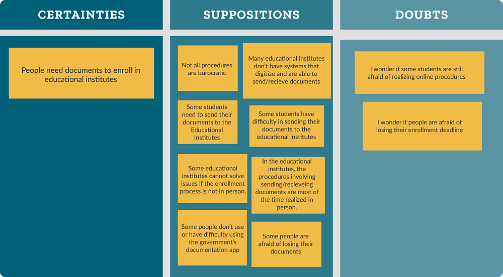
With the ideas collected, we moved to the next step: research.
Research
Quantitative
The CSD Matrix gave us ideas to elaborate questions for questionnaires. In the quantitative research we wanted to gather data about:
- How people dealt with their documents;
- The use of digital apps for documents;
- If people had pendent documents in EIs.
In this manner we created the following questions:

We elaborated a questionnaire using Google Forms, and shared it in groups related to the context of the issue we are dealing with.
We obtained the following results:
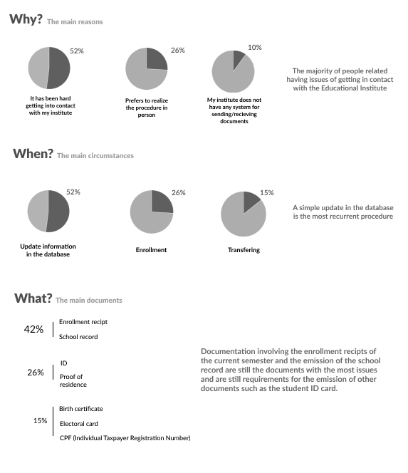
It was also discovered that the general public usually organize their documents in folders and wallets, risking losing or damaging them. Joining the research results, we noticed that the majority of people that did not report any issue with documents are using some form of digital app.
Qualitative
With the contacts we got through the quantitative research, we were able to perform the qualitative interviews, in which we noticed some patterns with the ones who had difficulty in sending documents to their educational institutes. These patterns are:
- Difficulty in getting in touch with the EI;
- Obtaining different information about the same issue when talking to different people of the EI staff;
- EIs difficulty in receiving documents and performing the procedures in an online way;
- The absence of a system that makes online procedures possible;
- The requirement, from the EI, that the document copies must be authenticated;
- User insecurity, doubting if the digital documents will or will not be accepted.
Why enrollment?
In the book “The Design of everyday things”, Don Norman affirms:
“When people go to a store to buy a drill, that is not their real goal. But why would anyone want a quarter-inch hole? Clearly that is an intermediate goal. Perhaps they wanted to hang shelves on the wall. Levitt stopped too soon. Once you realize that they don’t really want the drill, you realize that perhaps they don’t really want the hole, either: they want to install their bookshelves. Why not develop methods that don’t require holes? Or perhaps books that don’t require bookshelves.”
Because we noticed that our user’s main goal was not to send documents, we focused in the enrollment process, which is the task that will bring a bigger feeling of achievement for our users. The process of sending and receiving documents from the educational institutes would be a secondary goal.
With that choice in mind, which is justified not only by our user experience, but also in a business strategy perspective, our process of ideation and prototyping will be focused mainly focused in this procedure in specific.
Personas
Based on the information we had obtained this far, we created the following profile:
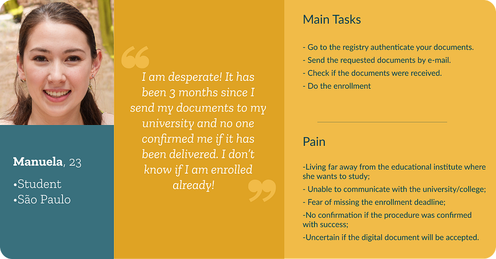
User Journey
The user journey is used to map the user’s whole trajectory, since the moment he/she feels the necessity of obtaining a product, until the step where the acquisition is concluded.
By using this tool, we looked forward to find the touch points our user has during the enrollment procedure, without our solution, to get a better understanding of the issue and how that affects what our user feels, think and speak. And then, we are able to discover the opportunities we can offer in each step.

Pixar Storytelling
We created a story, based on the Pixar Storytelling technique, for a better understanding of our users’ routine.
Manuela
Once upon a time Manuela, a 23-year-old student that live in São Paulo, she loves travelling and dreams of becoming a lawyer.
Everyday, she waited anxiously for the results of her exam, hoping to be approved in her dream college, which was in another state.
One day, Manuela discovered she had been approved, but to fill in her enrollment, it would be necessary to go to the educational institute in person. However, at that moment, she did not have enough money to get a plane and go to the university.
Because of that, she decided to look for a way to do her enrollment process online.
Because of that, she discovered an app that performed the procedure remotely.
Until finally, Manuela was able to enroll at her dream college even being hundreds of miles away from it. She felt very excited and happy with the simplicity and safety of the online procedure.
Solution Alternatives
We used the technique “How might we” so that our group could visualize the key points to be developed in our solution

The Solution
As from the solution, prioritized through the impact x effort matrix, each member of the group created their own sketches using the Crazy 8’s technique:


We gathered all the ideas from our group, aligned our main objectives and developed the following sketch:
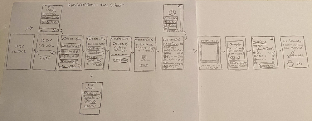
Wireframes
After the creation of our sketch, we moved to the next step of developing our app structure on Figma, starting with the wireframe and a low-fidelity prototype soon after.


You can test the low-fidelity prototype clicking here.
Usability Test — Medium-fidelity prototype
With the prototype well developed, usability tests with real users were made and our group obtained the following learnings:
- Always put the minimal information necessary in critical steps;
- It is necessary to have a hierarchy on the diagramming, otherwise the app is inducing the user to an error;
- The UX Writing step needs to be done with extreme caution, because if the user does not understand what is meant, there is no way he/she can communicate with the product’s interface;
- To have special care with the security and verification steps, because there can be incompatibility with certain devices;
- It is necessary to specify which is the service the app is offering, because even having a previous explanation, some users did not understand that one of the main functions of the app as to digitize documents;
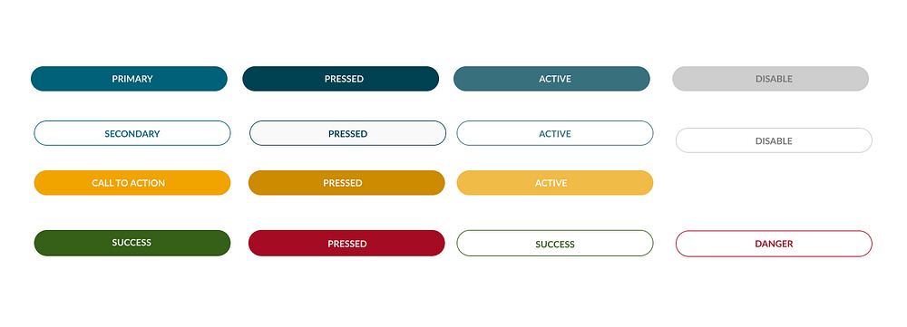
- We should set a pattern to buttons according to their relevance, then the user would not make an action by impulse.
User Flowchart
With the results obtained by our usability test, our group was able to define which was the way to be followed by our user in the app. To get a better view of the user flow, we made this Flowchart:

Style guide
After discussing about what would we like to convey to the user through our brand, we elaborated a style guide for our app.
Colors: A lot of documents used in procedures involving educational institutes have green and blue shades, and for that reason we choose to use a mix between both colors as our primary color. According to the psychology of colors, these two colors transmit feelings such as safety, trust and efficiency, which is the exactly what we want users to feel when using our app.

Typography: For the typography, we chose two webfonts: Lato and Zilla Slab, in the modular scale major third (1.25).
Both fonts are from the sans-serif family, that creates a pleasant reading of the texts for the users. We used 14 pixels as a pattern size instead of 12 (which is used in smartphones in most cases) because this size provides a better visualization of the texts.
We used Lato for paragraphs and buttons, and Zilla for titles. Both fonts give the app a tone of sophistication, elegance and modernity, that is the impression we aimed to have in our brand.

Buttons: After our selection of colors and typography, we developed the following buttons, aiming to give the user a organic feel.
Forms and Icons

High-fidelity prototype

You can test our high-fidelity prototype here.
Final considerations
When starting to project our solution, we put the options “Enrollment”, “Document Solicitation”, “Transfers” in our main menu, but we decided to prioritize the enrollment process in the user journey creation because of the high income an online enrollment procedure could bring and would be the option where both the users and clients are most satisfied, considering the high amount of enrollments there are in the beginning of a new school year.
